Mar Bay
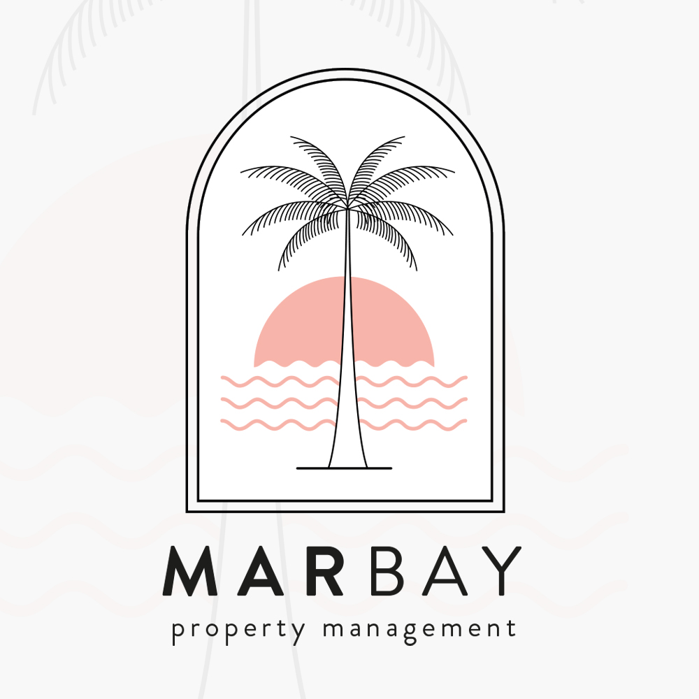
Squiggle Co was commissioned to create a new brand identity for Mar Bay, a luxury holiday and short-term rental company offering carefully curated properties along Spain’s Costa Blanca. The name Mar Bay draws from both Spanish and English—Mar meaning sea, and Bay referencing the calm, coastal landscapes that define the region—setting the tone for a brand rooted in sunshine, relaxation, and effortless living.
The brief was to develop a refined yet approachable visual identity that would appeal to travellers seeking a premium escape without feeling overly formal or corporate. Mar Bay needed a logo and supporting brand system that felt sun-soaked, calm, and aspirational, while remaining versatile enough to work across a wide range of digital and printed applications.
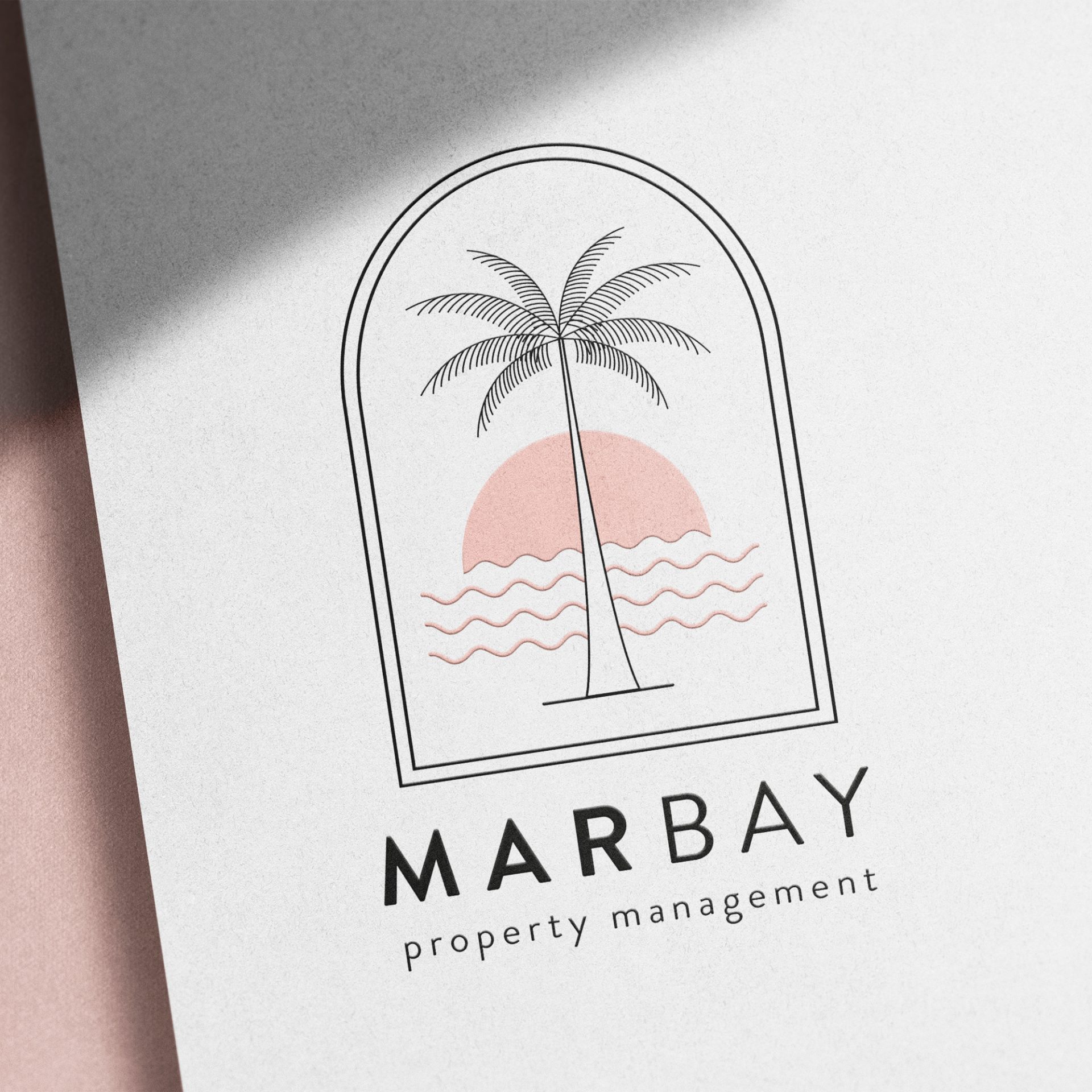
At the heart of the identity is a bespoke icon designed to represent the sun, sea, and an easy coastal lifestyle. The mark was intentionally kept simple and balanced, evoking warmth and movement without relying on obvious or overworked imagery. A soft, neutral base of greys was chosen to convey understated luxury, paired with a carefully selected pastel accent colour to add freshness and distinction—allowing the brand to stand out while maintaining a relaxed, elegant feel.
Clear, confident typography ensures the Mar Bay name is always front and centre, reinforcing brand recognition across every touchpoint. The logo was developed in multiple layouts and configurations to ensure consistency and flexibility, from social media and digital platforms to printed leaflets, signage, and sign-written vehicles.
The final identity captures the essence of coastal living on the Costa Blanca—sun-drenched, calm, and inviting—while positioning Mar Bay as a premium yet welcoming choice for travellers looking for a memorable escape.